

Correction of Chart
We made a mistake in this morning's chart and provided updated chart


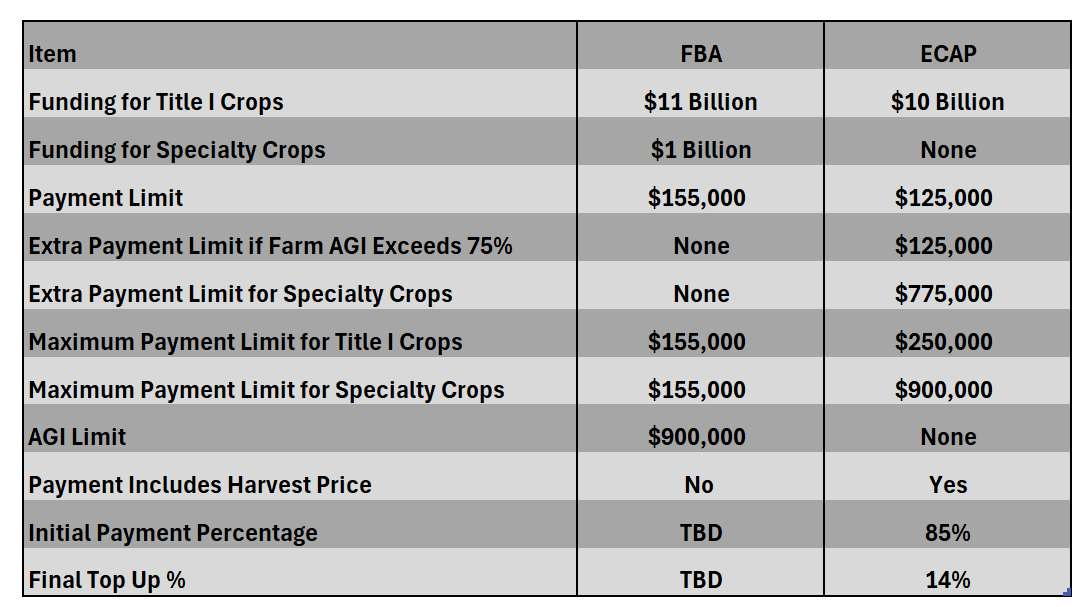
In this morning’s post we provide a chart showing the comparison of FBA versus ECAP. An observant reader noticed that we had the initial payment % and top up % in the wrong column.
Here is the updated chart:
We apologize for the mistake.